CSS CLASS
CSS INTRODUCTION

CSS Introduction
What is CSS?
CSS is the language we use to style a Web page.
- CSS stands for Cascading Style Sheets
- CSS describes how HTML elements are to be displayed on screen, paper, or in other media
- CSS saves a lot of work. It can control the layout of multiple web pages all at once
- External stylesheets are stored in CSS files
Why Use CSS?
CSS is used to define styles for your web pages, including the design, layout and variations in display for different devices and screen sizes.
CSS Example
body {
background-color: lightblue;
}
h1 {
color: white;
text-align: center;
}
p {
font-family: verdana;
font-size: 20px;
}CSS Saves a Lot of Work!
The CSS definitions are normally saved in an external .css file.
With an external stylesheet file, you can change the look of an entire website by changing just one file!
CSS Syntax
A CSS rule consists of a selector and a declaration block:
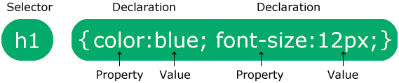
The selector points to the HTML element you want to style.
The declaration block contains one or more declarations separated by semicolons.
Each declaration includes a CSS property name and a value, separated by a colon.
Multiple CSS declarations are separated with semicolons, and declaration blocks are surrounded by curly braces.
Example
In this example all <p> elements will be center-aligned, with a red text color:
p {
color: red;
text-align: center;<!DOCTYPE html>
<html>
<head>
<style>
p {
color: red;
text-align: center;
}
</style>
</head>
<body>
<p>Hello World!</p>
<p>These paragraphs are styled with CSS.</p>
</body>
</html>
CSS Selectors
CSS selectors are used to "find" (or select) the HTML elements you want to style.
We can divide CSS selectors into five categories:
- Simple selectors (select elements based on name, id, class)
- Combinator selectors (select elements based on a specific relationship between them)
- Pseudo-class selectors (select elements based on a certain state)
- Pseudo-elements selectors (select and style a part of an element)
- Attribute selectors (select elements based on an attribute or attribute value)
This page will explain the most basic CSS selectors.
The CSS element Selector
The element selector selects HTML elements based on the element name.
Example
Here, all <p> elements on the page will be center-aligned, with a red text color:
<!DOCTYPE html>
<html>
<head>
<style>
p {
text-align: center;
color: red;
}
</style>
</head>
<body>
<p>Every paragraph will be affected by the style.</p>
<p id="para1">Me too!</p>
<p>And me!</p>
</body>
</html>
The CSS id Selector
The id selector uses the id attribute of an HTML element to select a specific element.
The id of an element is unique within a page, so the id selector is used to select one unique element!
To select an element with a specific id, write a hash (#) character, followed by the id of the element.
Example
<!DOCTYPE html>
<html>
<head>
<style>
#para1 {
text-align: center;
color: red;
}
</style>
</head>
<body>
<p id="para1">Hello World!</p>
<p>This paragraph is not affected by the style.</p>
</body>
</html>
The CSS class Selector
The class selector selects HTML elements with a specific class attribute.
To select elements with a specific class, write a period (.) character, followed by the class name.
Example
In this example all HTML elements with class="center" will be red and center-aligned:
<!DOCTYPE html>
<html>
<head>
<style>
.center {
text-align: center;
color: red;
}
</style>
</head>
<body>
<h1 class="center">Red and center-aligned heading</h1>
<p class="center">Red and center-aligned paragraph.</p>
</body>
</html>
You can also specify that only specific HTML elements should be affected by a class.
Example
In this example only <p> elements with class="center" will be red and center-aligned:
<!DOCTYPE html>
<html>
<head>
<style>
p.center {
text-align: center;
color: red;
}
</style>
</head>
<body>
<h1 class="center">This heading will not be affected</h1>
<p class="center">This paragraph will be red and center-aligned.</p>
</body>
</html>
HTML elements can also refer to more than one class.
Example
In this example the <p> element will be styled according to class="center" and to class="large":
<!DOCTYPE html>
<html>
<head>
<style>
p.center {
text-align: center;
color: red;
}
p.large {
font-size: 300%;
}
</style>
</head>
<body>
<h1 class="center">This heading will not be affected</h1>
<p class="center">This paragraph will be red and center-aligned.</p>
<p class="center large">This paragraph will be red, center-aligned, and in a large font-size.</p>
</body>
</html>
The CSS Universal Selector
The universal selector (*) selects all HTML elements on the page.
Example
The CSS rule below will affect every HTML element on the page:
<!DOCTYPE html>
<html>
<head>
<style>
* {
text-align: center;
color: blue;
}
</style>
</head>
<body>
<h1>Hello world!</h1>
<p>Every element on the page will be affected by the style.</p>
<p id="para1">Me too!</p>
<p>And me!</p>
</body>
</html>
It will be better to group the selectors, to minimize the code.
To group selectors, separate each selector with a comma.
Example
In this example we have grouped the selectors from the code above:
<!DOCTYPE html>
<html>
<head>
<style>
h1, h2, p {
text-align: center;
color: red;
}
</style>
</head>
<body>
<h1>Hello World!</h1>
<h2>Smaller heading!</h2>
<p>This is a paragraph.</p>
</body>
</html>
CSS Combinators
A combinator is something that defines the relationship between two or more selectors.
A CSS selector can contain more than one selector. Between the selectors, we can include a combinator, to create a more specific selection.
There are four different combinators in CSS:
- Descendant combinator (space)
- Child combinator (>)
- Next sibling combinator (+)
- Subsequent-sibling combinator (~)
Descendant Combinator (space)
The descendant combinator matches all elements that are descendants (children, grandchildren, etc.) of a specified element.
The following example selects all <p> elements inside <div> elements:
Example
Child Combinator (>)
The child combinator selects all elements that are direct children of a specified element.
The following example selects all <p> elements that are direct children of <div>:
Example
Next Sibling Combinator (+)
The next sibling combinator is used to select an element that is directly after a specific element.
Sibling elements must have the same parent element.
The following example selects the first <p> element that immediately follows a <div>, and share the same parent:
Example
Subsequent-sibling Combinator (~)
The subsequent-sibling combinator selects all elements that are next siblings of a specified element.
The following example selects all <p> elements that are next siblings of <div>, and share the same parent:
<!DOCTYPE html>
<html>
<head>
<style>
div ~ p {
background-color: yellow;
}
</style>
</head>
<body>
<h2>Subsequent-sibling Combinator (~)</h2>
<p>The ~ combinator selects all elements that are next siblings of a specified element.</p>
<p>The following example selects all p elements that are next siblings of div, and share the same parent:</p>
<p>Paragraph 1.</p>
<div>
<p>Paragraph 2.</p>
</div>
<p>Paragraph 3.</p>
<code>Some code.</code>
<p>Paragraph 4.</p>
</body>
</html>
CSS Pseudo-classes
A CSS pseudo-class is a keyword that can be added to a selector, to define a style for a special state of an element.
Some common use for pseudo-classes:
- Style an element when a user moves the mouse over it
- Style visited and unvisited links differently
- Style an element when it gets focus
- Style valid/invalid/required/optional form elements
- Style an element that is the first child of its parent
Syntax
Pseudo-classes are always denoted by a single colon (:) followed by the pseudo-class name:
selector:pseudo-class-name {
CSS properties
}Interactive Pseudo-classes
Interactive pseudo-classes apply styles based on user interaction:
:hover - When mouse is over an element:focus - When an element has focus:active - When an element is being activated:link - Unvisited links:visited - Visited links
Interactive pseudo-classes apply styles based on user interaction:
:hover - When mouse is over an element:focus - When an element has focus:active - When an element is being activated:link - Unvisited links:visited - Visited links
Structural Pseudo-classes
Structural pseudo-classes select elements based on their position in the document tree:
:first-child - First child of a parent:last-child - Last child of a parent:nth-child(n) - The nth child of a parent:lang() - Elements with a specific language
Structural pseudo-classes select elements based on their position in the document tree:
:first-child - First child of a parent:last-child - Last child of a parent:nth-child(n) - The nth child of a parent:lang() - Elements with a specific language
Pseudo-classes Used on Links
For HTML links, it is common to use the following pseudo-classes:
:link - Styles unvisited links:visited - Styles visited links:hover - Styles a link on mouse over:active - Styles an activated link
For HTML links, it is common to use the following pseudo-classes:
:link - Styles unvisited links:visited - Styles visited links:hover - Styles a link on mouse over:active - Styles an activated link
Example
Display links in different colors depending on state:
/* unvisited link */
a:link {
color: #FF0000;
}
/* visited link */
a:visited {
color: #00FF00;
}
/* mouse over link */
a:hover {
color: #FF00FF;
}
/* selected link */
a:active {
color: #0000FF;
} <!DOCTYPE html><html><head><style>/* unvisited link */a:link { color: red;}
/* visited link */a:visited { color: green;}
/* mouse over link */a:hover { color: hotpink;}
/* selected link */a:active { color: blue;}</style></head><body>
<h2>Styling a link depending on state</h2>
<p><b><a href="https://braintech1online.blogspot.com/" target="_blank">This is a link</a></b></p><p><b>Note:</b> a:hover MUST come after a:link and a:visited in the CSS definition in order to be effective.</p><p><b>Note:</b> a:active MUST come after a:hover in the CSS definition in order to be effective.</p>
</body></html>
Display links in different colors depending on state:
/* unvisited link */
a:link {
color: #FF0000;
}
/* visited link */
a:visited {
color: #00FF00;
}
/* mouse over link */
a:hover {
color: #FF00FF;
}
/* selected link */
a:active {
color: #0000FF;
} <!DOCTYPE html><html><head><style>/* unvisited link */a:link { color: red;}
/* visited link */a:visited { color: green;}
/* mouse over link */a:hover { color: hotpink;}
/* selected link */a:active { color: blue;}</style></head><body>
<h2>Styling a link depending on state</h2>
<p><b><a href="https://braintech1online.blogspot.com/" target="_blank">This is a link</a></b></p><p><b>Note:</b> a:hover MUST come after a:link and a:visited in the CSS definition in order to be effective.</p><p><b>Note:</b> a:active MUST come after a:hover in the CSS definition in order to be effective.</p>
</body></html> :hover on <div>
:hover pseudo-class on a <div> element:Example
focus on <input>
Here is an example of using the :focus pseudo-class to style an input field when it gets focus:
<!DOCTYPE html>
<html>
<head>
<style>
input:focus {
background-color: yellow;
}
</style>
</head>
<body>
<h2>Using :focus</h2>
<p>Use :focus to style an input field when it gets focus:</p>
<form action="/action_page.php" method="get">
First name: <input type="text" name="fname"><br><br>
Last name: <input type="text" name="lname"><br><br>
<input type="submit" value="Submit">
</form>
</body>
</html>
Pseudo-classes and HTML Classes
Pseudo-classes can easily be combined with HTML classes:
Example
Add a :hover pseudo-class to the <a> element with class "highlight":
<!DOCTYPE html>
<html>
<head>
<style>
a.highlight:hover {
color: #ff0000;
font-size: 22px;
}
</style>
</head>
<body>
<h2>Pseudo-classes and HTML Classes</h2>
<p>When you hover over the first link below, it will change color and font size:</p>
<p><a class="highlight" href="https://braintech1online.blogspot.com/">CSS Syntax</a></p>
<p><a href="https://braintech1online.blogspot.com/">CSS Tutorial</a></p>
</body>
</html>
Simple Tooltip Hover
Hover over a <div> element to show a <p> element (like a tooltip):
<!DOCTYPE html>
<html>
<head>
<style>
p {
display: none;
background-color: yellow;
padding: 20px;
}
div:hover + p {
display: block;
}
</style>
</head>
<body>
<h2>Use :hover to Show Tooltip</h2>
<P> COME HERE</P>
<div>Hover over this div element to show the p element
<p>Tada! Here I am!</p>
</div>
<P> COME HERE</P>
</body>
</html>
CSS Pseudo-Elements
A CSS pseudo-element is a keyword that can be added to a selector, to style a specific part of an element.
Some common use for pseudo-elements:
- Style the first letter or first line, of an element
- Insert content before or after an element
- Style the markers of list items
- Style the user-selected portion of an element
- Style the viewbox behind a dialog box
Syntax
Pseudo-elements are denoted by a double colon (::) followed by the pseudo-element name:
selector::pseudo-element-name {
CSS properties
}Text Pseudo-elements
Text pseudo-elements style specific parts of text content:
::first-line- Style the first line of text::first-letter- Style the first letter of text
Content Pseudo-elements
Content pseudo-elements insert or style generated content:
::before- Insert content before an element::after- Insert content after an element::marker- Style list item markers::selection- Style user-selected text::backdrop- Style dialog backdrop
Pseudo-elements for Text
Pseudo-elements for text, allow you to style specific parts of text content, such as the first line or first letter.
Pseudo-elements for text, allow you to style specific parts of text content, such as the first line or first letter.
The CSS ::first-line Pseudo-element
The ::first-line pseudo-element is used to add a special style to the first line of a text.
Note: The ::first-line pseudo-element can only be applied to block-level elements.
<!DOCTYPE html>
<html>
<head>
<style>
p::first-line {
color: red;
font-variant: small-caps;
font-size: 19px;
}
</style>
</head>
<body>
<h2>Using ::first-line</h2>
<p>You can use the ::first-line pseudo-element to add a special effect to the first line of a text. Some more text. And even more, and more, and more, and more, and more, and more, and more, and more, and more, and more, and more, and more.</p>
</body>
</html>
The ::first-line pseudo-element is used to add a special style to the first line of a text.
Note: The ::first-line pseudo-element can only be applied to block-level elements.
<!DOCTYPE html>
<html>
<head>
<style>
p::first-line {
color: red;
font-variant: small-caps;
font-size: 19px;
}
</style>
</head>
<body>
<h2>Using ::first-line</h2>
<p>You can use the ::first-line pseudo-element to add a special effect to the first line of a text. Some more text. And even more, and more, and more, and more, and more, and more, and more, and more, and more, and more, and more, and more.</p>
</body>
</html>
The CSS ::first-letter Pseudo-element
The ::first-letter pseudo-element is used to add a special style to the first letter of a text.
Note: The ::first-letter pseudo-element can only be applied to block-level elements.
Example
Format the first letter of the text in all <p> elements:
<!DOCTYPE html>
<html>
<head>
<style>
p::first-letter {
color: #ff0000;
font-size: xx-large;
}
h2::first-letter {
color: #dd0000;
font-size: xx-large;
}
</style>
</head>
<body>
<h2>Using ::first-letter ou can use the ::first-letter pseudo-element to add a special effect to the first character of a text!</h2>
<p>You can use the ::first-letter pseudo-element to add a special effect to the first character of a text!</p>
</body>
</html
Pseudo-elements and HTML Classes
Pseudo-elements can easily be combined with HTML classes.
Example
Display the first letter of <p> elements with class="intro", in red and in a larger size:
<!DOCTYPE html>
<html>
<head>
<style>
p.intro::first-letter {
color: #ff0000;
font-size: 200%;
}
</style>
</head>
<body>
<h2>Using pseudo-element and HTML class</h2>
<p class="intro">This is an introduction.</p>
<p>This is a paragraph with some text. A bit more text even.</p>
</body>
</html>
Multiple Pseudo-elements
Several pseudo-elements can also be combined.
In the following example, the first letter of <p> elements will be red and in an xx-large font size. The rest of the first line will be blue and in small-caps. The rest of the paragraph will be in the default font size and color:
<!DOCTYPE html>
<html>
<head>
<style>
p::first-letter {
color: red;
font-size: xx-large;
}
p::first-line {
color: blue;
font-variant: small-caps;
}
</style>
</head>
<body>
<h2>Use multiple pseudo-elements</h2>
<p>You can combine the ::first-letter and ::first-line pseudo-elements to add a special effect to the first letter and the first line of a text!</p>
</body>
</html>
CSS Background Attachment
CSS background-attachment
The background-attachment property specifies whether the background image should scroll or be fixed (will not scroll with the rest of the page):
Example
Specify that the background image should be fixed:
body {
background-image: url("img_tree.png");
background-repeat: no-repeat;
background-position: right top;
background-attachment: fixed;
}Example
Specify that the background image should scroll with the rest of the page:
body {
background-image: url("img_tree.png");
background-repeat: no-repeat;
background-position: right top;
background-attachment: scroll;
}CSS Background Shorthand
CSS background - Shorthand property
To shorten the code, it is possible to specify all the background properties in one single property. This is called a shorthand property.
Instead of writing:
body {
background-color: #ffffff;
background-image: url("img_tree.png");
background-repeat: no-repeat;
background-position: right top;
}You can use the shorthand property background:
Example
Use the shorthand property to set all the background properties in one declaration:
body {
background: #ffffff url("img_tree.png") no-repeat right top;
}The background property is a shorthand property for the following properties:
background-colorbackground-imagebackground-positionbackground-sizebackground-repeatbackground-attachmentbackground-originbackground-clip
If some of the property values are missing, they will be set to their initial (default) values.
All CSS Background Properties
| Property | Description |
|---|---|
| background | Sets all the background properties in one declaration |
| background-attachment | Sets whether a background image is fixed or scrolls with the rest of the page |
| background-clip | Specifies the painting area of the background |
| background-color | Sets the background color of an element |
| background-image | Sets the background image for an element |
| background-origin | Specifies where the background image(s) is/are positioned |
| background-position | Sets the starting position of a background image |
| background-repeat | Sets how a background image will be repeated |
| background-size | Specifies the size of the background image(s) |
CSS Borders
CSS Borders
The CSS border properties allow you to specify the style, width, and color of an element's border.
I have borders on all sides.
I have a red, bottom border.
I have rounded borders.
The CSS border properties allow you to specify the style, width, and color of an element's border.
I have borders on all sides.
I have a red, bottom border.
I have rounded borders.
CSS Border Style
The border-style property specifies what kind of border to display.
The following values are allowed:
dotted - Defines a dotted borderdashed - Defines a dashed bordersolid - Defines a solid borderdouble - Defines a double bordergroove - Defines a 3D grooved border. The effect depends on the border-color valueridge - Defines a 3D ridged border. The effect depends on the border-color valueinset - Defines a 3D inset border. The effect depends on the border-color valueoutset - Defines a 3D outset border. The effect depends on the border-color valuenone - Defines no borderhidden - Defines a hidden border
The border-style property can have from one to four values (for the top border, right border, bottom border, and the left border).
The border-style property specifies what kind of border to display.
The following values are allowed:
dotted - Defines a dotted borderdashed - Defines a dashed bordersolid - Defines a solid borderdouble - Defines a double bordergroove - Defines a 3D grooved border. The effect depends on the border-color valueridge - Defines a 3D ridged border. The effect depends on the border-color valueinset - Defines a 3D inset border. The effect depends on the border-color valueoutset - Defines a 3D outset border. The effect depends on the border-color valuenone - Defines no borderhidden - Defines a hidden border
The border-style property can have from one to four values (for the top border, right border, bottom border, and the left border).
Example
Demonstration of the different border styles:
p.dotted {border-style: dotted;}
p.dashed {border-style: dashed;}
p.solid {border-style: solid;}
p.double {border-style: double;}
p.groove {border-style: groove;}
p.ridge {border-style: ridge;}
p.inset {border-style: inset;}
p.outset {border-style: outset;}
p.none {border-style: none;}
p.hidden {border-style: hidden;}
p.mix {border-style: dotted dashed solid double;}Result:
A dotted border.
A dashed border.
A solid border.
A double border.
A groove border. The effect depends on the border-color value.
A ridge border. The effect depends on the border-color value.
An inset border. The effect depends on the border-color value.
An outset border. The effect depends on the border-color value.
No border.
A mixed border.
<!DOCTYPE html>
<html>
<head>
<style>
p.dotted {border-style: dotted;}
p.dashed {border-style: dashed;}
p.solid {border-style: solid;}
p.double {border-style: double;}
p.groove {border-style: groove;}
p.ridge {border-style: ridge;}
p.inset {border-style: inset;}
p.outset {border-style: outset;}
p.none {border-style: none;}
p.hidden {border-style: hidden;}
p.mix {border-style: dotted dashed solid double;}
</style>
</head>
<body>
<h2>The border-style Property</h2>
<p>This property specifies what kind of border to display:</p>
<p class="dotted">A dotted border.</p>
<p class="dashed">A dashed border.</p>
<p class="solid">A solid border.</p>
<p class="double">A double border.</p>
<p class="groove">A groove border.</p>
<p class="ridge">A ridge border.</p>
<p class="inset">An inset border.</p>
<p class="outset">An outset border.</p>
<p class="none">No border.</p>
<p class="hidden">A hidden border.</p>
<p class="mix">A mixed border.</p>
</body>
</html>
Demonstration of the different border styles:
p.dotted {border-style: dotted;}
p.dashed {border-style: dashed;}
p.solid {border-style: solid;}
p.double {border-style: double;}
p.groove {border-style: groove;}
p.ridge {border-style: ridge;}
p.inset {border-style: inset;}
p.outset {border-style: outset;}
p.none {border-style: none;}
p.hidden {border-style: hidden;}
p.mix {border-style: dotted dashed solid double;}Result:
A dotted border.
A dashed border.
A solid border.
A double border.
A groove border. The effect depends on the border-color value.
A ridge border. The effect depends on the border-color value.
An inset border. The effect depends on the border-color value.
An outset border. The effect depends on the border-color value.
No border.
A mixed border.
<!DOCTYPE html>
<html>
<head>
<style>
p.dotted {border-style: dotted;}
p.dashed {border-style: dashed;}
p.solid {border-style: solid;}
p.double {border-style: double;}
p.groove {border-style: groove;}
p.ridge {border-style: ridge;}
p.inset {border-style: inset;}
p.outset {border-style: outset;}
p.none {border-style: none;}
p.hidden {border-style: hidden;}
p.mix {border-style: dotted dashed solid double;}
</style>
</head>
<body>
<h2>The border-style Property</h2>
<p>This property specifies what kind of border to display:</p>
<p class="dotted">A dotted border.</p>
<p class="dashed">A dashed border.</p>
<p class="solid">A solid border.</p>
<p class="double">A double border.</p>
<p class="groove">A groove border.</p>
<p class="ridge">A ridge border.</p>
<p class="inset">An inset border.</p>
<p class="outset">An outset border.</p>
<p class="none">No border.</p>
<p class="hidden">A hidden border.</p>
<p class="mix">A mixed border.</p>
</body>
</html>
CSS Border Width
The border-width property specifies the width of the four borders.
The width can be set as a specific size (in px, pt, cm, em, etc) or by using one of the three pre-defined values: thin, medium, or thick:
<!DOCTYPE html>
<html>
<head>
<style>
p.one {
border-style: solid;
border-width: 5px;
}
p.two {
border-style: solid;
border-width: medium;
}
p.three {
border-style: dotted;
border-width: 2px;
}
p.four {
border-style: dotted;
border-width: thick;
}
p.five {
border-style: double;
border-width: 15px;
}
p.six {
border-style: double;
border-width: thick;
}
</style>
</head>
<body>
<h2>The border-width Property</h2>
<p>This property specifies the width of the four borders:</p>
<p class="one">Some text.</p>
<p class="two">Some text.</p>
<p class="three">Some text.</p>
<p class="four">Some text.</p>
<p class="five">Some text.</p>
<p class="six">Some text.</p>
<p><b>Note:</b> The "border-width" property does not work if it is used alone.
Always specify the "border-style" property to set the borders first.</p>
</body>
</html>
The border-width property specifies the width of the four borders.
The width can be set as a specific size (in px, pt, cm, em, etc) or by using one of the three pre-defined values: thin, medium, or thick:
<!DOCTYPE html>
<html>
<head>
<style>
p.one {
border-style: solid;
border-width: 5px;
}
p.two {
border-style: solid;
border-width: medium;
}
p.three {
border-style: dotted;
border-width: 2px;
}
p.four {
border-style: dotted;
border-width: thick;
}
p.five {
border-style: double;
border-width: 15px;
}
p.six {
border-style: double;
border-width: thick;
}
</style>
</head>
<body>
<h2>The border-width Property</h2>
<p>This property specifies the width of the four borders:</p>
<p class="one">Some text.</p>
<p class="two">Some text.</p>
<p class="three">Some text.</p>
<p class="four">Some text.</p>
<p class="five">Some text.</p>
<p class="six">Some text.</p>
<p><b>Note:</b> The "border-width" property does not work if it is used alone.
Always specify the "border-style" property to set the borders first.</p>
</body>
</html>
CSS Border Color
CSS Border Color
The border-color property is used to set the color of the four borders.
The color can be set by:
- name - specify a color name, like "red"
- HEX - specify a HEX value, like "#ff0000"
- RGB - specify a RGB value, like "rgb(255,0,0)"
- HSL - specify a HSL value, like "hsl(0, 100%, 50%)"
- transparent
Note: If border-color is not set, it inherits the color of the element.
The border-color property is used to set the color of the four borders.
The color can be set by:
- name - specify a color name, like "red"
- HEX - specify a HEX value, like "#ff0000"
- RGB - specify a RGB value, like "rgb(255,0,0)"
- HSL - specify a HSL value, like "hsl(0, 100%, 50%)"
- transparent
Note: If border-color is not set, it inherits the color of the element.
Example
Demonstration of the different border colors:
p.one {
border-style: solid;
border-color: red;
}
p.two {
border-style: solid;
border-color: green;
}
p.three {
border-style: dotted;
border-color: blue;
}Result:
Red borderGreen borderBlue border
Demonstration of the different border colors:
p.one {
border-style: solid;
border-color: red;
}
p.two {
border-style: solid;
border-color: green;
}
p.three {
border-style: dotted;
border-color: blue;
}Result:
Red borderGreen borderBlue border
Specific Side Colors
The border-color property can have from one to four values (for the top border, right border, bottom border, and the left border).
The border-color property can have from one to four values (for the top border, right border, bottom border, and the left border).
Example
p.one {
border-style: solid;
border-color: red green blue yellow; /* red top, green right, blue bottom and yellow left */
}HEX Values
The color of the border can also be specified using a hexadecimal value (HEX):
Example
p.one {
border-style: solid;
border-color: #ff0000; /* red */
RGB Values
Or by using RGB values:
Example
p.one {
border-style: solid;
border-color: rgb(255, 0, 0); /* red */
}
REMOVE ADS
HSL Values
You can also use HSL values:
Example
p.one {
border-style: solid;
border-color: hsl(0, 100%, 50%); /* red */
}
}
CSS Border Sides
Share
Link Copied
CSS Border - Individual Sides
From the examples on the previous pages, you have seen that it is possible to specify a different border for each side.
In CSS, there are also properties for specifying each of the borders (top, right, bottom, and left):
border-top-style
border-right-style
border-bottom-style
border-left-style
In the example below we use the four properties above to set the style of each border side:
Example
p {
border-top-style: dotted;
border-right-style: solid;
border-bottom-style: dotted;
border-left-style: solid;
}
Result:
Different Border Styles
We can also use the shorthand border-style property to achieve the same result.
The example below gives the same result as the example above:
Example
p {
border-style: dotted solid;
}
Result:
Different Border Styles
So, here is how it works:
If the border-style property has four values:
border-style: dotted solid double dashed;
top border is dotted
right border is solid
bottom border is double
left border is dashed
If the border-style property has three values:
border-style: dotted solid double;
top border is dotted
right and left borders are solid
bottom border is double
If the border-style property has two values:
border-style: dotted solid;
top and bottom borders are dotted
right and left borders are solid
If the border-style property has one value:
border-style: dotted;
all four borders are dotted
Example
/* Four values */
p {
border-style: dotted solid double dashed;
}
/* Three values */
p {
border-style: dotted solid double;
}
/* Two values */
p {
border-style: dotted solid;
}
/* One value */
p {
border-style: dotted;
}
CSS Shorthand Border Property
Share
Link Copied
CSS Border - Shorthand Property
Like you saw in the previous page, there are many properties to consider when dealing with borders.
To shorten the code, it is also possible to specify all the individual border properties in one property.
The border property is a shorthand property for the following individual border properties:
border-width
border-style (required)
border-color
Example
p {
border: 5px solid red;
}
Result:
Some text
You can also specify all the individual border properties for just one side:
Left Border
p {
border-left: 6px solid red;
}
Result:
Some text
Bottom Border
p {
border-bottom: 6px solid red;
}
Result:
CSS Rounded Borders
Share
Link Copied
CSS Rounded Borders
The border-radius property is used to add rounded borders to an element:
Normal border
Round border
Rounder border
Roundest border
Example
p {
border: 2px solid red;
border-radius: 5px;
}
More Examples
All the top border properties in one declaration
This example demonstrates a shorthand property for setting all of the properties for the top border in one declaration.
Set the style of the bottom border
This example demonstrates how to set the style of the bottom border.
Set the width of the left border
This example demonstrates how to set the width of the left border.
Set the color of the four borders
This example demonstrates how to set the color of the four borders. It can have from one to four colors.
Set the color of the right border
This example demonstrates how to set the color of the right border.
REMOVE ADS
Exercise
?
Drag and drop the correct property and value to create an element with rounded corners.
p {
border: 2px solid red;
: ;
}
All CSS Border Properties
Property Description
border Sets all the border properties in one declaration
border-bottom Sets all the bottom border properties in one declaration
border-bottom-color Sets the color of the bottom border
border-bottom-style Sets the style of the bottom border
border-bottom-width Sets the width of the bottom border
border-color Sets the color of the four borders
border-left Sets all the left border properties in one declaration
border-left-color Sets the color of the left border
border-left-style Sets the style of the left border
border-left-width Sets the width of the left border
border-radius Sets all the four border-*-radius properties for rounded corners
border-right Sets all the right border properties in one declaration
border-right-color Sets the color of the right border
border-right-style Sets the style of the right border
border-right-width Sets the width of the right border
border-style Sets the style of the four borders
border-top Sets all the top border properties in one declaration
border-top-color Sets the color of the top border
border-top-style Sets the style of the top border
border-top-width Sets the width of the top border
CSS Margins
Share
Link Copied
CSS Margins
The CSS margin properties are used to create space around elements, outside of any defined borders.
Margins define the distance between an element's border and the surrounding elements.
With CSS, you have full control over the margins. CSS has properties for setting the margin for each individual side of an element (top, right, bottom, and left), and a shorthand property for setting all the margin properties in one declaration.
This element has a margin of 70px.
Margin - Individual Sides
CSS has properties for specifying the margin for each side of an element:
margin-top - sets the top margin of an element
margin-right - sets the right margin of an element
margin-bottom - sets the bottom margin of an element
margin-left - sets the left margin of an element
All the margin properties can have the following values:
auto - the browser calculates the margin
length - specifies a margin in px, pt, cm, etc.
% - specifies a margin in % of the width of the containing element
inherit - specifies that the margin should be inherited from the parent element
Tip: Negative values are also allowed.
Example
Set different margins for all four sides of a <p> element:
p {
margin-top: 100px;
margin-bottom: 100px;
margin-right: 150px;
margin-left: 80px;
}
REMOVE ADS
Margin - Shorthand Property
To shorten the code, it is possible to specify all the margin properties in one declaration.
The margin property is a shorthand property for the following individual margin properties:
margin-top
margin-right
margin-bottom
margin-left
Here is how it works:
If the margin property has four values:
margin: 25px 50px 75px 100px;
top margin is 25px
right margin is 50px
bottom margin is 75px
left margin is 100px
Example
Use the margin shorthand property with four values:
p {
margin: 25px 50px 75px 100px;
}
If the margin property has three values:
margin: 25px 50px 75px;
top margin is 25px
right and left margins are 50px
bottom margin is 75px
Example
Use the margin shorthand property with three values:
p {
margin: 25px 50px 75px;
}
If the margin property has two values:
margin: 25px 50px;
top and bottom margins are 25px
right and left margins are 50px
Example
Use the margin shorthand property with two values:
p {
margin: 25px 50px;
}
If the margin property has one value:
margin: 25px;
all four margins are 25px
CSS Margin Collapse
Share
Link Copied
CSS Margin Collapse
Margin collapse is when two margins collapse into a single margin.
Top and bottom margins of elements are sometimes collapsed into a single margin that is equal to the largest of the two margins.
Note: Margin collapse only happens with top and bottom margins! Not left and right margins!
In the following example, the <h1> element has a bottom margin of 50px and the <h2> element has a top margin of 20px. So, the vertical margin between the <h1> and the <h2> would be a total of 70px (50px + 20px). But due to margin collapse, the actual margin ends up being 50px:
Example
Demonstration of margin collapse:
h1 {
margin-bottom: 50px;
}
h2 {
margin-top: 20px;
}
In the following example, each <p> element has a top margin of 30px and a bottom margin of 30px. So, the vertical margin between the <p> elements should have been 60px (30px + 30px). However, due to margin collapse, the actual margin ends up being 30px:
Example
Demonstration of margin collapse:
p {
margin-top: 30px;
margin-bottom: 30px;
}
REMOVE ADS
All CSS Margin Properties
Property Description
margin A shorthand property for setting all the margin properties in one declaration
margin-bottom Sets the bottom margin of an element
margin-left Sets the left margin of an element
margin-right Sets the right margin of an element
margin-top Sets the top margin of an element
CSS Padding
Share
Link Copied
CSS Padding
The CSS padding properties are used to generate space around an element's content, inside of any defined borders.
With CSS, you have full control over the padding. There are properties for setting the padding for each side of an element (top, right, bottom, and left), and a shorthand property for setting all the padding properties in one declaration.
This element has a padding of 70px.
Padding - Individual Sides
CSS has properties for specifying the padding for each side of an element:
padding-top - sets the top padding of an element
padding-right - sets the right padding of an element
padding-bottom - sets the bottom padding of an element
padding-left - sets the left padding of an element
All the padding properties can have the following values:
length - specifies a padding in px, pt, cm, etc.
% - specifies a padding in % of the width of the containing element
inherit - specifies that the padding should be inherited from the parent element
Note: Negative values are not allowed.
Example
Set different padding for all four sides of a <div> element:
div {
padding-top: 50px;
padding-right: 30px;
padding-bottom: 50px;
padding-left: 80px;
}
REMOVE ADS
Padding - Shorthand Property
To shorten the code, it is possible to specify all the padding properties in one declaration.
The padding property is a shorthand property for the following individual padding properties:
padding-top
padding-right
padding-bottom
padding-left
Here is how it works:
If the padding property has four values:
padding: 25px 50px 75px 100px;
top padding is 25px
right padding is 50px
bottom padding is 75px
left padding is 100px
Example
Use the padding shorthand property with four values:
div {
padding: 25px 50px 75px 100px;
}
If the padding property has three values:
padding: 25px 50px 75px;
top padding is 25px
right and left paddings are 50px
bottom padding is 75px
Example
Use the padding shorthand property with three values:
div {
padding: 25px 50px 75px;
}
If the padding property has two values:
padding: 25px 50px;
top and bottom paddings are 25px
right and left paddings are 50px
Example
Use the padding shorthand property with two values:
div {
padding: 25px 50px;
}
If the padding property has one value:
padding: 25px;
all four paddings are 25px
Example
Use the padding shorthand property with one value:
div {
padding: 25px;
}
More Examples
Set the left-padding property
This example demonstrates how to set the left padding of a <p> element.
Set the right-padding property
This example demonstrates how to set the right padding of a <p> element.
Set the top-padding property
This example demonstrates how to set the top padding of a <p> element.
Set the bottom-padding property
This example demonstrates how to set the bottom padding of a <p> element.
CSS Padding and box-sizing
Share
Link Copied
Padding and Element Width
The CSS width property specifies the width of the element's content area. The content area is the portion inside the padding, border, and margin of an element (the box model).
So, if an element has a specified width, the padding added to that element will be added to the total width of the element. This is often an undesirable result.
Example
Here, the <div> element is given a width of 300px. However, the actual width of the <div> element will be 350px (300px + 25px of left padding + 25px of right padding):
div {
width: 300px;
padding: 25px;
}
Padding and box-sizing
The box-sizing property defines how the width and height of an element are calculated: should they include padding and borders, or not.
The box-sizing property can have the following values:
content-box - This is default. The width and height properties includes only the content (border and padding are not included)
border-box - The width and height properties includes content, padding and border
So, to keep the width at 300px, no matter the amount of padding, you can use the box-sizing: border-box;. This causes the element to maintain its actual width; if you increase the padding, the available content space will decrease.
Example
Use the box-sizing property to keep the width at 300px, no matter the amount of padding:
div {
width: 300px;
padding: 25px;
box-sizing: border-box;
}
REMOVE ADS
All CSS Padding Properties
Property Description
padding A shorthand property for setting all the padding properties in one declaration
padding-bottom Sets the bottom padding of an element
padding-left Sets the left padding of an element
padding-right Sets the right padding of an element
padding-top Sets the top padding of an element
CSS Height and WidthShare
Link CopiedCSS Height and WidthThe CSS height and width properties are used to set the height and width of an element.
This element has a height of 70 pixels and a width of 100%.
CSS Set height and widthThe height and width properties are used to set the height and width of an element.
The height and width do not include padding, borders, or margins. It sets the height and width of the area inside the padding, border, and margin of the element.
CSS height and width ValuesThe height and width properties can have the following values:
auto - This is default. The browser calculates the height and widthlength - Defines the height or width in px, cm, em, etc.% - Defines the height or width in percent of the containing blockinitial - Sets the height or width to its default valueinherit - The height or width will be inherited from its parent valueREMOVE ADS
CSS height and width ExamplesThis element has a height of 200 pixels and a width of 50%ExampleSet the height and width of a <div> element:
div { height: 200px; width: 50%; background-color: powderblue;}
This element has a height of 100 pixels and a width of 500 pixels.ExampleSet the height and width of another <div> element:
div { height: 100px; width: 500px; background-color: powderblue;}
Note: Remember that the height and width properties do not include padding, borders, or margins! They set the height/width of the area inside the padding, border, and margin of the element!
REMOVE ADS
Try it Yourself - ExamplesSet the height and width of elementsThis example demonstrates how to set the height and width of different elements.
Set the height and width of an image using percentThis example demonstrates how to set the height and width of an image using a percent value.
CSS OutlineShare
Link CopiedCSS OutlineAn outline is a line that is drawn around elements, OUTSIDE the borders, to make the element "stand out".
This element has a black border and a green outline with a width of 5px.
Note: Outline differs from borders! The outline is drawn outside the element's border, and may overlap other content. Also, the outline is NOT a part of the element's dimensions; the element's total width and height is not affected by the width of the outline.
CSS has the following outline properties:
outline-style - Specifies the style of the outlineoutline-color - Specifies the color of the outlineoutline-width - Specifies the width of the outlineoutline-offset - Adds space between the outline and the edge/border of an elementoutline - A shorthand propertyREMOVE ADS
CSS The outline-style PropertyThe outline-style property specifies the style of the outline, and can have one of the following values:
dotted - Defines a dotted outlinedashed - Defines a dashed outlinesolid - Defines a solid outlinedouble - Defines a double outlinegroove - Defines a 3D grooved outlineridge - Defines a 3D ridged outlineinset - Defines a 3D inset outlineoutset - Defines a 3D outset outlinenone - Defines no outlinehidden - Defines a hidden outlineThe following example shows the different outline-style values:
ExampleDemonstration of the different outline styles:
p.dotted {outline-style: dotted;}p.dashed {outline-style: dashed;}p.solid {outline-style: solid;}p.double {outline-style: double;}p.groove {outline-style: groove;}p.ridge {outline-style: ridge;}p.inset {outline-style: inset;}p.outset {outline-style: outset;}Result:
A dotted outline.
A dashed outline.
A solid outline.
A double outline.
A groove outline. The effect depends on the outline-color value.
A ridge outline. The effect depends on the outline-color value.
An inset outline. The effect depends on the outline-color value.
An outset outline. The effect depends on the outline-color value.
Note: None of the other outline properties (which you will learn more about in the next chapters) will have ANY effect unless the outline-style property is set!
Exercise?Drag and drop the correct property and value to create a dotted outline around <p>.p.dotted { : ;}
CSS Outline WidthThe outline-width property specifies the width of the outline, and can have one of the following values:
thin (typically 1px)medium (typically 3px)thick (typically 5px)A specific size (in px, pt, cm, em, etc)CSS Outline Width ExamplesHere are some outlines with different widths:
A thin outline.
A medium outline.
A thick outline.
A 8px thick outline.
Example Demonstration of different outline widths:
p { padding: 5px; outline-style: solid; outline-color: green;}
p.ex1 { outline-width: thin;}
p.ex2 { outline-width: medium;}
p.ex3 { outline-width: thick;}
p.ex4 { outline-width: 8px;}
CSS Outline ColorShare
Link CopiedCSS Outline ColorThe outline-color property is used to set the color of the outline.
The color can be set by:
name - specify a color name, like "red"HEX - specify a hex value, like "#ff0000"RGB - specify a RGB value, like "rgb(255,0,0)"HSL - specify a HSL value, like "hsl(0, 100%, 50%)"invert - performs a color inversion (which ensures that the outline is visible, regardless of color background)CSS Outline Color ExamplesHere are some different outlines with different colors. Also notice that these elements also have a thin black border inside the outline:
A solid red outline.
A dotted blue outline.
An outset green outline.
A solid invert outline.
Example Demonstration of different outline colors:
p { border: 1px solid black; padding: 5px;}
p.ex1 { outline-style: solid; outline-color: red;}
p.ex2 { outline-style: dotted; outline-color: blue;}
p.ex3 { outline-style: outset; outline-color: green;}
p.ex4 { outline-style: solid; outline-color: invert;}HEX ValuesThe outline color can also be specified using a hexadecimal value (HEX):
Examplep.ex1 { outline-style: solid; outline-color: #ff0000; /* red */}
REMOVE ADS
RGB ValuesOr by using RGB values:
Examplep.ex1 { outline-style: solid; outline-color: rgb(255, 0, 0); /* red */}HSL ValuesYou can also use HSL values:
Examplep.ex1 { outline-style: solid; outline-color: hsl(0, 100%, 50%); /* red */}
CSS Outline ShorthandShare
Link CopiedCSS Outline - Shorthand propertyThe outline property is a shorthand property for setting the following individual outline properties:
outline-widthoutline-style (required)outline-colorYou can specify one, two, or three values from the list above. The order of the values does not matter.
CSS Outline Shorthand ExamplesHere are some different outlines specified with the shorthand outline property:
A dashed outline.
A dotted red outline.
A 7px solid yellow outline.
A thick ridge pink outline.
Example Demonstration of the outline shorthand property:
p.ex1 {outline: dashed;}p.ex2 {outline: dotted red;}p.ex3 {outline: 7px solid yellow;}p.ex4 {outline: thick ridge pink;}
CSS Outline With Rounded CornersOutlines can also have rounded corners.
The border-radius property is used to add rounded borders to an element.
Here are some different outlines with rounded corners:
A dashed outline.
A dotted red outline.
A 7px solid yellow outline.
A thick ridge pink outline.
Examplep.ex1 { outline: dashed; border-radius: 8px;}
p.ex2 { outline: dotted red; border-radius: 5px;}
p.ex3 { outline: 7px solid yellow; border-radius: 5px;}
p.ex4 { outline: thick ridge pink; border-radius: 8px;}
p.ex5 { outline: thick solid green; border-radius: 10px;}
CSS Outline OffsetShare
Link CopiedCSS Outline OffsetThe outline-offset property adds a space between an outline and the edge/border of an element. The space between an element and its outline is transparent.
The following example specifies an outline 15px outside the border edge:
This paragraph has a black border and a red outline 15px outside the border edge.
Examplep { margin: 30px; padding: 5px; border: 1px solid black; outline: 3px solid red; outline-offset: 15px;}The following example shows that the space between an element's border and its outline is transparent:
This paragraph has an outline of 15px outside the border edge.
Examplep { margin: 30px; padding: 5px; background: yellow; border: 1px solid black; outline: 3px solid red; outline-offset: 15px;}
REMOVE ADS
CSS Outline Offset with Negative ValueThe following example shows the use of an outline-offset with a negative value, now the outline will be placed inside the border edge:
This paragraph has a black border and a red outline -5px inside the border edge.
Examplep { margin: 30px; padding: 5px; background: yellow; border: 1px solid black; outline: 3px solid red; outline-offset: -5px;}Exercise?What does the outline-offset property do?
Sets the thickness of the outlineAdds space between the outline and the edge/border of an elementSpecifies the color of the outline
All CSS Outline PropertiesProperty Descriptionoutline A shorthand property for setting outline-width, outline-style, and outline-color in one declarationoutline-color Sets the color of an outlineoutline-offset Specifies the space between an outline and the edge or border of an elementoutline-style Sets the style of an outlineoutline-width Sets the width of an outline
CSS Text ColorShare
Link CopiedCSS Text FormattingCSS has a lot of properties for styling and formatting text.
text formattingThis text is styled with some of the text formatting properties. The heading uses the text-align, text-transform, and color properties. The paragraph is indented, aligned, and the space between characters is specified. The underline is removed from this colored "Try it Yourself" link.
CSS Text ColorThe color property is used to set the color of the text. The color is specified by:
a color name - like "red"a HEX value - like "#ff0000"an RGB value - like "rgb(255,0,0)"Look at CSS Color Values for a complete list of possible color values.
The default text color for a page is defined in the body selector.
Examplebody { color: blue;}
h1 { color: green;}
h2 { color: red;}
REMOVE ADS
Text Color and Background ColorIn this example, we define both the background-color property and the color property:
Examplebody { background-color: lightgrey; color: blue;}
h1 { background-color: black; color: white;}
div { background-color: blue; color: white;}Important: High contrast is very important for people with vision problems. So, always ensure that the contrast between the text color and the background color (or background image) is good!
Exercise?Which property is used to set the color of the text in CSS?
background-colortext-colorcolorfont-color
The CSS Text Color PropertyProperty Descriptioncolor Specifies the color of text
CSS Text AlignmentShare
Link CopiedCSS Text Alignment and Text DirectionIn this chapter you will learn about the following properties:
text-aligntext-align-lastvertical-aligndirectionunicode-bidiText AlignmentThe text-align property is used to set the horizontal alignment of a text.
This property can have one of the following values:
left - Aligns the text to the leftright - Aligns the text to the rightcenter - Centers the textjustify - Stretches the lines so that each line has equal widthThe following example shows left, right and center aligned text (left is default if text direction is left-to-right, and right is default if text direction is right-to-left):
Exampleh1 { text-align: center;}
h2 { text-align: left;}
h3 { text-align: right;}When the text-align property is set to "justify", each line is stretched so that every line has equal width, and the left and right margins are straight (like in magazines and newspapers):
Examplediv { text-align: justify;}Text Align LastThe text-align-last property specifies how to align the last line of a text.
This property can have one of the following values:
auto - Default value. The last line is justified and aligned leftleft - The last line is aligned to the leftright - The last line is aligned to the rightcenter - The last line is center-alignedjustify - The last line is justified as the rest of the linesstart - The last line is aligned at the start of the lineend - The last line is aligned at the end of the lineExampleDifferent alignment of the last line in three <p> elements:
p.a { text-align-last: right;}
p.b { text-align-last: center;}
p.c { text-align-last: justify;}
REMOVE ADS
Vertical AlignmentThe vertical-align property sets the vertical alignment of an element.
This property can have one of the following values:
baseline - Default value. The element is aligned with the baseline of the parentlength/% - Raises or lower an element by the specified length or percentsub - The element is aligned with the subscript baseline of the parentsuper - The element is aligned with the superscript baseline of the parenttop - The element is aligned with the top of the tallest element on the linetext-top - The element is aligned with the top of the parent element's fontmiddle - The element is placed in the middle of the parent elementbottom - The element is aligned with the lowest element on the linetext-bottom - The element is aligned with the bottom of the parent element's fontExampleSet the vertical alignment of an image in a text:
img.a { vertical-align: baseline;}
img.b { vertical-align: text-top;}
img.c { vertical-align: text-bottom;}
img.d { vertical-align: sub;}
img.e { vertical-align: super;}
REMOVE ADS
Text DirectionThe direction property specifies the text direction/writing direction within a block-level element.
Tip: Use this property together with the unicode-bidi property to set or return whether the text should be overridden to support multiple languages in the same document.
Examplep { direction: rtl; unicode-bidi: bidi-override;}The CSS Text Alignment/Direction PropertiesProperty Descriptiondirection Specifies the text direction/writing directiontext-align Specifies the horizontal alignment of texttext-align-last Specifies how to align the last line of a textunicode-bidi Used together with the direction property to set or return whether the text should be overridden to support multiple languages in the same documentvertical-align Sets the vertical alignment of an element
W3Schools app - someone is ahead of you in the weekly league REMOVE ADS
New
W3Schools Adventure AppCoding fundamentals as a game. Bite-sized lessons and challenges.
Download on theApp StoreGET IT ONGoogle PlayLearn more »Ready to start your journey?Your streak is waiting.+60 XPW3Schools Adventure tutorW3Schools Adventure mapPLUSSPACESGET CERTIFIEDFOR TEACHERSPRACTICECONTACT USTop TutorialsHTML TutorialCSS TutorialJavaScript TutorialHow To TutorialSQL TutorialPython TutorialW3.CSS TutorialBootstrap TutorialPHP TutorialJava TutorialC++ TutorialjQuery TutorialTop ReferencesHTML ReferenceCSS ReferenceJavaScript ReferenceSQL ReferencePython ReferenceW3.CSS ReferenceBootstrap ReferencePHP ReferenceHTML ColorsJava ReferenceAngularJS ReferencejQuery ReferenceTop ExamplesHTML ExamplesCSS ExamplesJavaScript ExamplesHow To ExamplesSQL ExamplesPython ExamplesW3.CSS ExamplesBootstrap ExamplesPHP ExamplesJava ExamplesXML ExamplesjQuery ExamplesGet CertifiedHTML CertificateCSS CertificateJavaScript CertificateFront End CertificateSQL CertificatePython CertificatePHP CertificatejQuery CertificateJava CertificateC++ CertificateC# CertificateXML Certificate FORUM ABOUT ACADEMYW3Schools is optimized for learning and training. Examples might be simplified to improve reading and learning. Tutorials, references, and examples are constantly reviewed to avoid errors, but we cannot warrant full correctness of all content. While using W3Schools, you agree to have read and accepted our terms of use, cookies and privacy policy.
Copyright 1999-2026 by Refsnes Data. All Rights Reserved. W3Schools is Powered by W3.CSS.
CSS Text DecorationShare
Link CopiedCSS Text DecorationThe CSS text-decoration property is used to control the appearance of decorative lines on text.
It is a shorthand property for the following individual properties:
text-decoration-linetext-decoration-colortext-decoration-styletext-decoration-thicknessAdd a Decoration Line to TextThe CSS text-decoration-line property sets the type of decoration line added to the text.
This property can have one or more of the following values:
none - Default value. Displays no decoration lineunderline - The decoration line is displayed under the textoverline - The decoration line is displayed over the textline-through - The decoration line is displayed through the textTip: You can combine multiple values, like overline and underline to display lines both over and under a text.
ExampleSet different types of decoration lines:
h1 { text-decoration-line: overline;}
h2 { text-decoration-line: line-through;}
h3 { text-decoration-line: underline;}
p { text-decoration-line: overline underline;}Note: It is not recommended to underline text that is not a link, as this often confuses the reader!
REMOVE ADS
Specify a Color for the Decoration LineThe CSS text-decoration-color property is used to set the color of the decoration line.
ExampleAdd different colors to the decoration line:
h1 { text-decoration-line: overline; text-decoration-color: red;}
h2 { text-decoration-line: line-through; text-decoration-color: blue;}
h3 { text-decoration-line: underline; text-decoration-color: green;}
p { text-decoration-line: overline underline; text-decoration-color: purple;}CSS Text Decoration StylesShare
Link CopiedSpecify a Style for the Decoration LineThe CSS text-decoration-style property sets the style of the decoration line.
This property can have one of the following values:
solid - Default value. Single linedouble - Double linedotted - Dotted linedashed - Dashed linewavy - Wavy lineExampleAdd different styles for the decoration line:
h1 { text-decoration-line: underline; text-decoration-style: solid;}
h2 { text-decoration-line: underline; text-decoration-style: double;}
h3 { text-decoration-line: underline; text-decoration-style: dotted;}
p.ex1 { text-decoration-line: underline; text-decoration-style: dashed;}
p.ex2 { text-decoration-line: underline; text-decoration-style: wavy;}
p.ex3 { text-decoration-line: underline; text-decoration-color: red; text-decoration-style: wavy;}REMOVE ADS
Specify the Thickness for the Decoration LineThe CSS text-decoration-thickness property is used to set the thickness of the decoration line.
ExampleAdd different thickness for the decoration line:
h1 { text-decoration-line: underline; text-decoration-thickness: auto;}
h2 { text-decoration-line: underline; text-decoration-thickness: 5px;}
h3 { text-decoration-line: underline; text-decoration-thickness: 25%;}
p { text-decoration-line: underline; text-decoration-color: red; text-decoration-style: double; text-decoration-thickness: 5px;}The Shorthand PropertyThe CSS text-decoration property is a shorthand property for:
text-decoration-line (required)text-decoration-color (optional)text-decoration-style (optional)text-decoration-thickness (optional)Exampleh1 { text-decoration: underline;}
h2 { text-decoration: underline red;}
h3 { text-decoration: underline red double;}
p { text-decoration: underline red double 5px;}A Small Tip on LinksAll links in HTML are underlined by default. Sometimes you see that links are styled with no underline. The text-decoration: none; is used to remove the underline from links, like this:
Examplea { text-decoration: none;}
CSS Text TransformationShare
Link CopiedCSS Text TransformationThe CSS text-transform property is used to control the capitalization of text in an element.
It can be used to transform a text into uppercase or lowercase letters, or capitalize the first letter of each word, without changing the original content in HTML.
This property can have one of the following values:
none - No transformation. Text renders as it iscapitalize - Transforms the first character of each word to uppercaseuppercase - Transforms all characters to uppercaselowercase - Transforms all characters to lowercaseExampleDemonstration of the text-transform property:
p.uppercase { text-transform: uppercase;}
p.lowercase { text-transform: lowercase;}
p.capitalize { text-transform: capitalize;}REMOVE ADS
Exercise?Drag and drop the correct property and value to make all letters inside a <p> element uppercase.p { : ;}
The CSS Text Transformation PropertyProperty Descriptiontext-transform Controls the capitalization of text
CSS Text SpacingShare
Link CopiedCSS Text SpacingCSS has several properties to control text spacing.
In this chapter you will learn about the following properties:
text-indentletter-spacingline-heightword-spacingwhite-spaceCSS Text IndentationThe CSS text-indent property is used to specify the indentation of the first line in a text-block.
Tip: Negative values are allowed. The first line will be indented to the left if the value is negative.
ExampleIndent the first line of text in a text-block:
p { text-indent: 50px;}CSS Letter SpacingThe CSS letter-spacing property is used to specify the space between the characters in a text.
Tip: Negative values are allowed.
ExampleIncrease and decrease the space between characters:
h1 { letter-spacing: 5px;}
h2 { letter-spacing: -2px;}CSS Line HeightThe CSS line-height property is used to specify the space between lines.
Note: Negative values are not allowed.
ExampleSpecify the space between lines:
p.small { line-height: 0.8;}
p.big { line-height: 1.8;}REMOVE ADS
CSS Word SpacingThe CSS word-spacing property is used to specify the space between the words in a text.
Tip: Negative values are allowed.
ExampleIncrease and decrease the space between words:
p.one { word-spacing: 10px;}
p.two { word-spacing: -2px;}CSS White SpaceThe CSS white-space property specifies how white-space inside an element is handled.
This property can have one of the following values:
normalnowrapprepre-linepre-wrapExampleHow to disable text wrapping inside an element
p { white-space: nowrap;}The CSS Text Spacing PropertiesProperty Descriptionletter-spacing Specifies the space between characters in a textline-height Specifies the line heighttext-indent Specifies the indentation of the first line in a text-blockwhite-space Specifies how to handle white-space inside an elementword-spacing Specifies the space between words in a text
CSS Text ShadowShare
Link CopiedCSS Text ShadowThe text-shadow property adds shadow to text.
In its simplest use, you only specify the horizontal and the vertical shadow.
In addition, you can add a shadow color and blur effect.
Text shadow effect!ExampleHorizontal and vertical shadow:
h1 { text-shadow: 2px 2px;}Next, add a color (red) to the shadow:
Text shadow effect!ExampleHorizontal and vertical shadow, with color:
h1 { text-shadow: 2px 2px red;}Then, add a blur effect (5px) to the shadow:
Text shadow effect!ExampleHorizontal and vertical shadow, with color and blur effect:
h1 { text-shadow: 2px 2px 5px red;}More Text Shadow ExamplesText shadow effect!ExampleText-shadow on a white text:
h1 { color: white; text-shadow: 2px 2px 4px #000000;}Text shadow effect!ExampleText-shadow with red neon glow:
h1 { text-shadow: 0 0 3px #ff0000;}REMOVE ADS
Multiple ShadowsThe text-shadow property also accepts multiple shadows for an element. Define each shadow in a comma-separated list.
The following example shows a red and blue neon glow shadow:
Text shadow effect!ExampleText-shadow with red and blue neon glow:
h1 { text-shadow: 0 0 3px #ff0000, 0 0 5px #0000ff;}The following example shows a white text with black, blue, and red neon glow:
Text shadow effect!ExampleText-shadow with black, blue and red neon glow:
h1 { color: white; text-shadow: 1px 1px 2px black, 0 0 25px blue, 0 0 5px red;}Tip: Go to our CSS Fonts chapter to learn about how to change fonts, text size and the style of a text.
Tip: Go to our CSS Text Effects chapter to learn about different text effects.
The CSS Text Shadow PropertyProperty Descriptiontext-shadow Specifies the shadow effect added to text
p.one {
border-style: solid;
border-color: red green blue yellow; /* red top, green right, blue bottom and yellow left */
}HEX Values
The color of the border can also be specified using a hexadecimal value (HEX):
Example
p.one {
border-style: solid;
border-color: #ff0000; /* red */
RGB Values
Or by using RGB values:
Example
p.one {
border-style: solid;
border-color: rgb(255, 0, 0); /* red */
}
REMOVE ADS
HSL Values
You can also use HSL values:
Example
p.one {
border-style: solid;
border-color: hsl(0, 100%, 50%); /* red */
}
}
CSS Border Sides
Share
Link Copied
CSS Border - Individual Sides
From the examples on the previous pages, you have seen that it is possible to specify a different border for each side.
In CSS, there are also properties for specifying each of the borders (top, right, bottom, and left):
border-top-style
border-right-style
border-bottom-style
border-left-style
In the example below we use the four properties above to set the style of each border side:
Example
p {
border-top-style: dotted;
border-right-style: solid;
border-bottom-style: dotted;
border-left-style: solid;
}
Result:
Different Border Styles
We can also use the shorthand border-style property to achieve the same result.
The example below gives the same result as the example above:
Example
p {
border-style: dotted solid;
}
Result:
Different Border Styles
So, here is how it works:
If the border-style property has four values:
border-style: dotted solid double dashed;
top border is dotted
right border is solid
bottom border is double
left border is dashed
If the border-style property has three values:
border-style: dotted solid double;
top border is dotted
right and left borders are solid
bottom border is double
If the border-style property has two values:
border-style: dotted solid;
top and bottom borders are dotted
right and left borders are solid
If the border-style property has one value:
border-style: dotted;
all four borders are dotted
Example
/* Four values */
p {
border-style: dotted solid double dashed;
}
/* Three values */
p {
border-style: dotted solid double;
}
/* Two values */
p {
border-style: dotted solid;
}
/* One value */
p {
border-style: dotted;
}
CSS Shorthand Border Property
Share
Link Copied
CSS Border - Shorthand Property
Like you saw in the previous page, there are many properties to consider when dealing with borders.
To shorten the code, it is also possible to specify all the individual border properties in one property.
The border property is a shorthand property for the following individual border properties:
border-width
border-style (required)
border-color
Example
p {
border: 5px solid red;
}
Result:
Some text
You can also specify all the individual border properties for just one side:
Left Border
p {
border-left: 6px solid red;
}
Result:
Some text
Bottom Border
p {
border-bottom: 6px solid red;
}
Result:
CSS Rounded Borders
Share
Link Copied
CSS Rounded Borders
The border-radius property is used to add rounded borders to an element:
Normal border
Round border
Rounder border
Roundest border
Example
p {
border: 2px solid red;
border-radius: 5px;
}
More Examples
All the top border properties in one declaration
This example demonstrates a shorthand property for setting all of the properties for the top border in one declaration.
Set the style of the bottom border
This example demonstrates how to set the style of the bottom border.
Set the width of the left border
This example demonstrates how to set the width of the left border.
Set the color of the four borders
This example demonstrates how to set the color of the four borders. It can have from one to four colors.
Set the color of the right border
This example demonstrates how to set the color of the right border.
REMOVE ADS
Exercise
?
Drag and drop the correct property and value to create an element with rounded corners.
p {
border: 2px solid red;
: ;
}
All CSS Border Properties
Property Description
border Sets all the border properties in one declaration
border-bottom Sets all the bottom border properties in one declaration
border-bottom-color Sets the color of the bottom border
border-bottom-style Sets the style of the bottom border
border-bottom-width Sets the width of the bottom border
border-color Sets the color of the four borders
border-left Sets all the left border properties in one declaration
border-left-color Sets the color of the left border
border-left-style Sets the style of the left border
border-left-width Sets the width of the left border
border-radius Sets all the four border-*-radius properties for rounded corners
border-right Sets all the right border properties in one declaration
border-right-color Sets the color of the right border
border-right-style Sets the style of the right border
border-right-width Sets the width of the right border
border-style Sets the style of the four borders
border-top Sets all the top border properties in one declaration
border-top-color Sets the color of the top border
border-top-style Sets the style of the top border
border-top-width Sets the width of the top border
CSS Margins
Share
Link Copied
CSS Margins
The CSS margin properties are used to create space around elements, outside of any defined borders.
Margins define the distance between an element's border and the surrounding elements.
With CSS, you have full control over the margins. CSS has properties for setting the margin for each individual side of an element (top, right, bottom, and left), and a shorthand property for setting all the margin properties in one declaration.
This element has a margin of 70px.
Margin - Individual Sides
CSS has properties for specifying the margin for each side of an element:
margin-top - sets the top margin of an element
margin-right - sets the right margin of an element
margin-bottom - sets the bottom margin of an element
margin-left - sets the left margin of an element
All the margin properties can have the following values:
auto - the browser calculates the margin
length - specifies a margin in px, pt, cm, etc.
% - specifies a margin in % of the width of the containing element
inherit - specifies that the margin should be inherited from the parent element
Tip: Negative values are also allowed.
Example
Set different margins for all four sides of a <p> element:
p {
margin-top: 100px;
margin-bottom: 100px;
margin-right: 150px;
margin-left: 80px;
}
REMOVE ADS
Margin - Shorthand Property
To shorten the code, it is possible to specify all the margin properties in one declaration.
The margin property is a shorthand property for the following individual margin properties:
margin-top
margin-right
margin-bottom
margin-left
Here is how it works:
If the margin property has four values:
margin: 25px 50px 75px 100px;
top margin is 25px
right margin is 50px
bottom margin is 75px
left margin is 100px
Example
Use the margin shorthand property with four values:
p {
margin: 25px 50px 75px 100px;
}
If the margin property has three values:
margin: 25px 50px 75px;
top margin is 25px
right and left margins are 50px
bottom margin is 75px
Example
Use the margin shorthand property with three values:
p {
margin: 25px 50px 75px;
}
If the margin property has two values:
margin: 25px 50px;
top and bottom margins are 25px
right and left margins are 50px
Example
Use the margin shorthand property with two values:
p {
margin: 25px 50px;
}
If the margin property has one value:
margin: 25px;
all four margins are 25px
CSS Margin Collapse
Share
Link Copied
CSS Margin Collapse
Margin collapse is when two margins collapse into a single margin.
Top and bottom margins of elements are sometimes collapsed into a single margin that is equal to the largest of the two margins.
Note: Margin collapse only happens with top and bottom margins! Not left and right margins!
In the following example, the <h1> element has a bottom margin of 50px and the <h2> element has a top margin of 20px. So, the vertical margin between the <h1> and the <h2> would be a total of 70px (50px + 20px). But due to margin collapse, the actual margin ends up being 50px:
Example
Demonstration of margin collapse:
h1 {
margin-bottom: 50px;
}
h2 {
margin-top: 20px;
}
In the following example, each <p> element has a top margin of 30px and a bottom margin of 30px. So, the vertical margin between the <p> elements should have been 60px (30px + 30px). However, due to margin collapse, the actual margin ends up being 30px:
Example
Demonstration of margin collapse:
p {
margin-top: 30px;
margin-bottom: 30px;
}
REMOVE ADS
All CSS Margin Properties
Property Description
margin A shorthand property for setting all the margin properties in one declaration
margin-bottom Sets the bottom margin of an element
margin-left Sets the left margin of an element
margin-right Sets the right margin of an element
margin-top Sets the top margin of an element
CSS Padding
Share
Link Copied
CSS Padding
The CSS padding properties are used to generate space around an element's content, inside of any defined borders.
With CSS, you have full control over the padding. There are properties for setting the padding for each side of an element (top, right, bottom, and left), and a shorthand property for setting all the padding properties in one declaration.
This element has a padding of 70px.
Padding - Individual Sides
CSS has properties for specifying the padding for each side of an element:
padding-top - sets the top padding of an element
padding-right - sets the right padding of an element
padding-bottom - sets the bottom padding of an element
padding-left - sets the left padding of an element
All the padding properties can have the following values:
length - specifies a padding in px, pt, cm, etc.
% - specifies a padding in % of the width of the containing element
inherit - specifies that the padding should be inherited from the parent element
Note: Negative values are not allowed.
Example
Set different padding for all four sides of a <div> element:
div {
padding-top: 50px;
padding-right: 30px;
padding-bottom: 50px;
padding-left: 80px;
}
REMOVE ADS
Padding - Shorthand Property
To shorten the code, it is possible to specify all the padding properties in one declaration.
The padding property is a shorthand property for the following individual padding properties:
padding-top
padding-right
padding-bottom
padding-left
Here is how it works:
If the padding property has four values:
padding: 25px 50px 75px 100px;
top padding is 25px
right padding is 50px
bottom padding is 75px
left padding is 100px
Example
Use the padding shorthand property with four values:
div {
padding: 25px 50px 75px 100px;
}
If the padding property has three values:
padding: 25px 50px 75px;
top padding is 25px
right and left paddings are 50px
bottom padding is 75px
Example
Use the padding shorthand property with three values:
div {
padding: 25px 50px 75px;
}
If the padding property has two values:
padding: 25px 50px;
top and bottom paddings are 25px
right and left paddings are 50px
Example
Use the padding shorthand property with two values:
div {
padding: 25px 50px;
}
If the padding property has one value:
padding: 25px;
all four paddings are 25px
Example
Use the padding shorthand property with one value:
div {
padding: 25px;
}
More Examples
Set the left-padding property
This example demonstrates how to set the left padding of a <p> element.
Set the right-padding property
This example demonstrates how to set the right padding of a <p> element.
Set the top-padding property
This example demonstrates how to set the top padding of a <p> element.
Set the bottom-padding property
This example demonstrates how to set the bottom padding of a <p> element.
CSS Padding and box-sizing
Share
Link Copied
Padding and Element Width
The CSS width property specifies the width of the element's content area. The content area is the portion inside the padding, border, and margin of an element (the box model).
So, if an element has a specified width, the padding added to that element will be added to the total width of the element. This is often an undesirable result.
Example
Here, the <div> element is given a width of 300px. However, the actual width of the <div> element will be 350px (300px + 25px of left padding + 25px of right padding):
div {
width: 300px;
padding: 25px;
}
Padding and box-sizing
The box-sizing property defines how the width and height of an element are calculated: should they include padding and borders, or not.
The box-sizing property can have the following values:
content-box - This is default. The width and height properties includes only the content (border and padding are not included)
border-box - The width and height properties includes content, padding and border
So, to keep the width at 300px, no matter the amount of padding, you can use the box-sizing: border-box;. This causes the element to maintain its actual width; if you increase the padding, the available content space will decrease.
Example
Use the box-sizing property to keep the width at 300px, no matter the amount of padding:
div {
width: 300px;
padding: 25px;
box-sizing: border-box;
}
REMOVE ADS
All CSS Padding Properties
Property Description
padding A shorthand property for setting all the padding properties in one declaration
padding-bottom Sets the bottom padding of an element
padding-left Sets the left padding of an element
padding-right Sets the right padding of an element
padding-top Sets the top padding of an element
CSS Height and WidthShare
Link CopiedCSS Height and WidthThe CSS height and width properties are used to set the height and width of an element.
This element has a height of 70 pixels and a width of 100%.
CSS Set height and widthThe height and width properties are used to set the height and width of an element.
The height and width do not include padding, borders, or margins. It sets the height and width of the area inside the padding, border, and margin of the element.
CSS height and width ValuesThe height and width properties can have the following values:
auto - This is default. The browser calculates the height and widthlength - Defines the height or width in px, cm, em, etc.% - Defines the height or width in percent of the containing blockinitial - Sets the height or width to its default valueinherit - The height or width will be inherited from its parent valueREMOVE ADS
CSS height and width ExamplesThis element has a height of 200 pixels and a width of 50%ExampleSet the height and width of a <div> element:
div { height: 200px; width: 50%; background-color: powderblue;}
This element has a height of 100 pixels and a width of 500 pixels.ExampleSet the height and width of another <div> element:
div { height: 100px; width: 500px; background-color: powderblue;}
Note: Remember that the height and width properties do not include padding, borders, or margins! They set the height/width of the area inside the padding, border, and margin of the element!
REMOVE ADS
Try it Yourself - ExamplesSet the height and width of elementsThis example demonstrates how to set the height and width of different elements.
Set the height and width of an image using percentThis example demonstrates how to set the height and width of an image using a percent value.
CSS OutlineShare
Link CopiedCSS OutlineAn outline is a line that is drawn around elements, OUTSIDE the borders, to make the element "stand out".
This element has a black border and a green outline with a width of 5px.
Note: Outline differs from borders! The outline is drawn outside the element's border, and may overlap other content. Also, the outline is NOT a part of the element's dimensions; the element's total width and height is not affected by the width of the outline.
CSS has the following outline properties:
outline-style - Specifies the style of the outlineoutline-color - Specifies the color of the outlineoutline-width - Specifies the width of the outlineoutline-offset - Adds space between the outline and the edge/border of an elementoutline - A shorthand propertyREMOVE ADS
CSS The outline-style PropertyThe outline-style property specifies the style of the outline, and can have one of the following values:
dotted - Defines a dotted outlinedashed - Defines a dashed outlinesolid - Defines a solid outlinedouble - Defines a double outlinegroove - Defines a 3D grooved outlineridge - Defines a 3D ridged outlineinset - Defines a 3D inset outlineoutset - Defines a 3D outset outlinenone - Defines no outlinehidden - Defines a hidden outlineThe following example shows the different outline-style values:
ExampleDemonstration of the different outline styles:
p.dotted {outline-style: dotted;}p.dashed {outline-style: dashed;}p.solid {outline-style: solid;}p.double {outline-style: double;}p.groove {outline-style: groove;}p.ridge {outline-style: ridge;}p.inset {outline-style: inset;}p.outset {outline-style: outset;}Result:
A dotted outline.
A dashed outline.
A solid outline.
A double outline.
A groove outline. The effect depends on the outline-color value.
A ridge outline. The effect depends on the outline-color value.
An inset outline. The effect depends on the outline-color value.
An outset outline. The effect depends on the outline-color value.
Note: None of the other outline properties (which you will learn more about in the next chapters) will have ANY effect unless the outline-style property is set!
Exercise?Drag and drop the correct property and value to create a dotted outline around <p>.p.dotted { : ;}
CSS Outline WidthThe outline-width property specifies the width of the outline, and can have one of the following values:
thin (typically 1px)medium (typically 3px)thick (typically 5px)A specific size (in px, pt, cm, em, etc)CSS Outline Width ExamplesHere are some outlines with different widths:
A thin outline.
A medium outline.
A thick outline.
A 8px thick outline.
Example Demonstration of different outline widths:
p { padding: 5px; outline-style: solid; outline-color: green;}
p.ex1 { outline-width: thin;}
p.ex2 { outline-width: medium;}
p.ex3 { outline-width: thick;}
p.ex4 { outline-width: 8px;}
CSS Outline ColorShare
Link CopiedCSS Outline ColorThe outline-color property is used to set the color of the outline.
The color can be set by:
name - specify a color name, like "red"HEX - specify a hex value, like "#ff0000"RGB - specify a RGB value, like "rgb(255,0,0)"HSL - specify a HSL value, like "hsl(0, 100%, 50%)"invert - performs a color inversion (which ensures that the outline is visible, regardless of color background)CSS Outline Color ExamplesHere are some different outlines with different colors. Also notice that these elements also have a thin black border inside the outline:
A solid red outline.
A dotted blue outline.
An outset green outline.
A solid invert outline.
Example Demonstration of different outline colors:
p { border: 1px solid black; padding: 5px;}
p.ex1 { outline-style: solid; outline-color: red;}
p.ex2 { outline-style: dotted; outline-color: blue;}
p.ex3 { outline-style: outset; outline-color: green;}
p.ex4 { outline-style: solid; outline-color: invert;}HEX ValuesThe outline color can also be specified using a hexadecimal value (HEX):
Examplep.ex1 { outline-style: solid; outline-color: #ff0000; /* red */}
REMOVE ADS
RGB ValuesOr by using RGB values:
Examplep.ex1 { outline-style: solid; outline-color: rgb(255, 0, 0); /* red */}HSL ValuesYou can also use HSL values:
Examplep.ex1 { outline-style: solid; outline-color: hsl(0, 100%, 50%); /* red */}
CSS Outline ShorthandShare
Link CopiedCSS Outline - Shorthand propertyThe outline property is a shorthand property for setting the following individual outline properties:
outline-widthoutline-style (required)outline-colorYou can specify one, two, or three values from the list above. The order of the values does not matter.
CSS Outline Shorthand ExamplesHere are some different outlines specified with the shorthand outline property:
A dashed outline.
A dotted red outline.
A 7px solid yellow outline.
A thick ridge pink outline.
Example Demonstration of the outline shorthand property:
p.ex1 {outline: dashed;}p.ex2 {outline: dotted red;}p.ex3 {outline: 7px solid yellow;}p.ex4 {outline: thick ridge pink;}
CSS Outline With Rounded CornersOutlines can also have rounded corners.
The border-radius property is used to add rounded borders to an element.
Here are some different outlines with rounded corners:
A dashed outline.
A dotted red outline.
A 7px solid yellow outline.
A thick ridge pink outline.
Examplep.ex1 { outline: dashed; border-radius: 8px;}
p.ex2 { outline: dotted red; border-radius: 5px;}
p.ex3 { outline: 7px solid yellow; border-radius: 5px;}
p.ex4 { outline: thick ridge pink; border-radius: 8px;}
p.ex5 { outline: thick solid green; border-radius: 10px;}
CSS Outline OffsetShare
Link CopiedCSS Outline OffsetThe outline-offset property adds a space between an outline and the edge/border of an element. The space between an element and its outline is transparent.
The following example specifies an outline 15px outside the border edge:
This paragraph has a black border and a red outline 15px outside the border edge.
Examplep { margin: 30px; padding: 5px; border: 1px solid black; outline: 3px solid red; outline-offset: 15px;}The following example shows that the space between an element's border and its outline is transparent:
This paragraph has an outline of 15px outside the border edge.
Examplep { margin: 30px; padding: 5px; background: yellow; border: 1px solid black; outline: 3px solid red; outline-offset: 15px;}
REMOVE ADS
CSS Outline Offset with Negative ValueThe following example shows the use of an outline-offset with a negative value, now the outline will be placed inside the border edge:
This paragraph has a black border and a red outline -5px inside the border edge.
Examplep { margin: 30px; padding: 5px; background: yellow; border: 1px solid black; outline: 3px solid red; outline-offset: -5px;}Exercise?What does the outline-offset property do?
Sets the thickness of the outlineAdds space between the outline and the edge/border of an elementSpecifies the color of the outline
All CSS Outline PropertiesProperty Descriptionoutline A shorthand property for setting outline-width, outline-style, and outline-color in one declarationoutline-color Sets the color of an outlineoutline-offset Specifies the space between an outline and the edge or border of an elementoutline-style Sets the style of an outlineoutline-width Sets the width of an outline
CSS Text ColorShare
Link CopiedCSS Text FormattingCSS has a lot of properties for styling and formatting text.
text formattingThis text is styled with some of the text formatting properties. The heading uses the text-align, text-transform, and color properties. The paragraph is indented, aligned, and the space between characters is specified. The underline is removed from this colored "Try it Yourself" link.
CSS Text ColorThe color property is used to set the color of the text. The color is specified by:
a color name - like "red"a HEX value - like "#ff0000"an RGB value - like "rgb(255,0,0)"Look at CSS Color Values for a complete list of possible color values.
The default text color for a page is defined in the body selector.
Examplebody { color: blue;}
h1 { color: green;}
h2 { color: red;}
REMOVE ADS
Text Color and Background ColorIn this example, we define both the background-color property and the color property:
Examplebody { background-color: lightgrey; color: blue;}
h1 { background-color: black; color: white;}
div { background-color: blue; color: white;}Important: High contrast is very important for people with vision problems. So, always ensure that the contrast between the text color and the background color (or background image) is good!
Exercise?Which property is used to set the color of the text in CSS?
background-colortext-colorcolorfont-color
The CSS Text Color PropertyProperty Descriptioncolor Specifies the color of text
CSS Text AlignmentShare
Link CopiedCSS Text Alignment and Text DirectionIn this chapter you will learn about the following properties:
text-aligntext-align-lastvertical-aligndirectionunicode-bidiText AlignmentThe text-align property is used to set the horizontal alignment of a text.
This property can have one of the following values:
left - Aligns the text to the leftright - Aligns the text to the rightcenter - Centers the textjustify - Stretches the lines so that each line has equal widthThe following example shows left, right and center aligned text (left is default if text direction is left-to-right, and right is default if text direction is right-to-left):
Exampleh1 { text-align: center;}
h2 { text-align: left;}
h3 { text-align: right;}When the text-align property is set to "justify", each line is stretched so that every line has equal width, and the left and right margins are straight (like in magazines and newspapers):
Examplediv { text-align: justify;}Text Align LastThe text-align-last property specifies how to align the last line of a text.
This property can have one of the following values:
auto - Default value. The last line is justified and aligned leftleft - The last line is aligned to the leftright - The last line is aligned to the rightcenter - The last line is center-alignedjustify - The last line is justified as the rest of the linesstart - The last line is aligned at the start of the lineend - The last line is aligned at the end of the lineExampleDifferent alignment of the last line in three <p> elements:
p.a { text-align-last: right;}
p.b { text-align-last: center;}
p.c { text-align-last: justify;}
REMOVE ADS
Vertical AlignmentThe vertical-align property sets the vertical alignment of an element.
This property can have one of the following values:
baseline - Default value. The element is aligned with the baseline of the parentlength/% - Raises or lower an element by the specified length or percentsub - The element is aligned with the subscript baseline of the parentsuper - The element is aligned with the superscript baseline of the parenttop - The element is aligned with the top of the tallest element on the linetext-top - The element is aligned with the top of the parent element's fontmiddle - The element is placed in the middle of the parent elementbottom - The element is aligned with the lowest element on the linetext-bottom - The element is aligned with the bottom of the parent element's fontExampleSet the vertical alignment of an image in a text:
img.a { vertical-align: baseline;}
img.b { vertical-align: text-top;}
img.c { vertical-align: text-bottom;}
img.d { vertical-align: sub;}
img.e { vertical-align: super;}
REMOVE ADS
Text DirectionThe direction property specifies the text direction/writing direction within a block-level element.
Tip: Use this property together with the unicode-bidi property to set or return whether the text should be overridden to support multiple languages in the same document.
Examplep { direction: rtl; unicode-bidi: bidi-override;}The CSS Text Alignment/Direction PropertiesProperty Descriptiondirection Specifies the text direction/writing directiontext-align Specifies the horizontal alignment of texttext-align-last Specifies how to align the last line of a textunicode-bidi Used together with the direction property to set or return whether the text should be overridden to support multiple languages in the same documentvertical-align Sets the vertical alignment of an element
W3Schools app - someone is ahead of you in the weekly league REMOVE ADS
New
W3Schools Adventure AppCoding fundamentals as a game. Bite-sized lessons and challenges.
Download on theApp StoreGET IT ONGoogle PlayLearn more »Ready to start your journey?Your streak is waiting.+60 XPW3Schools Adventure tutorW3Schools Adventure mapPLUSSPACESGET CERTIFIEDFOR TEACHERSPRACTICECONTACT USTop TutorialsHTML TutorialCSS TutorialJavaScript TutorialHow To TutorialSQL TutorialPython TutorialW3.CSS TutorialBootstrap TutorialPHP TutorialJava TutorialC++ TutorialjQuery TutorialTop ReferencesHTML ReferenceCSS ReferenceJavaScript ReferenceSQL ReferencePython ReferenceW3.CSS ReferenceBootstrap ReferencePHP ReferenceHTML ColorsJava ReferenceAngularJS ReferencejQuery ReferenceTop ExamplesHTML ExamplesCSS ExamplesJavaScript ExamplesHow To ExamplesSQL ExamplesPython ExamplesW3.CSS ExamplesBootstrap ExamplesPHP ExamplesJava ExamplesXML ExamplesjQuery ExamplesGet CertifiedHTML CertificateCSS CertificateJavaScript CertificateFront End CertificateSQL CertificatePython CertificatePHP CertificatejQuery CertificateJava CertificateC++ CertificateC# CertificateXML Certificate FORUM ABOUT ACADEMYW3Schools is optimized for learning and training. Examples might be simplified to improve reading and learning. Tutorials, references, and examples are constantly reviewed to avoid errors, but we cannot warrant full correctness of all content. While using W3Schools, you agree to have read and accepted our terms of use, cookies and privacy policy.
Copyright 1999-2026 by Refsnes Data. All Rights Reserved. W3Schools is Powered by W3.CSS.
CSS Text DecorationShare
Link CopiedCSS Text DecorationThe CSS text-decoration property is used to control the appearance of decorative lines on text.
It is a shorthand property for the following individual properties:
text-decoration-linetext-decoration-colortext-decoration-styletext-decoration-thicknessAdd a Decoration Line to TextThe CSS text-decoration-line property sets the type of decoration line added to the text.
This property can have one or more of the following values:
none - Default value. Displays no decoration lineunderline - The decoration line is displayed under the textoverline - The decoration line is displayed over the textline-through - The decoration line is displayed through the textTip: You can combine multiple values, like overline and underline to display lines both over and under a text.
ExampleSet different types of decoration lines:
h1 { text-decoration-line: overline;}
h2 { text-decoration-line: line-through;}
h3 { text-decoration-line: underline;}
p { text-decoration-line: overline underline;}Note: It is not recommended to underline text that is not a link, as this often confuses the reader!
REMOVE ADS
Specify a Color for the Decoration LineThe CSS text-decoration-color property is used to set the color of the decoration line.
ExampleAdd different colors to the decoration line:
h1 { text-decoration-line: overline; text-decoration-color: red;}
h2 { text-decoration-line: line-through; text-decoration-color: blue;}
h3 { text-decoration-line: underline; text-decoration-color: green;}
p { text-decoration-line: overline underline; text-decoration-color: purple;}CSS Text Decoration StylesShare
Link CopiedSpecify a Style for the Decoration LineThe CSS text-decoration-style property sets the style of the decoration line.
This property can have one of the following values:
solid - Default value. Single linedouble - Double linedotted - Dotted linedashed - Dashed linewavy - Wavy lineExampleAdd different styles for the decoration line:
h1 { text-decoration-line: underline; text-decoration-style: solid;}
h2 { text-decoration-line: underline; text-decoration-style: double;}
h3 { text-decoration-line: underline; text-decoration-style: dotted;}
p.ex1 { text-decoration-line: underline; text-decoration-style: dashed;}
p.ex2 { text-decoration-line: underline; text-decoration-style: wavy;}
p.ex3 { text-decoration-line: underline; text-decoration-color: red; text-decoration-style: wavy;}REMOVE ADS
Specify the Thickness for the Decoration LineThe CSS text-decoration-thickness property is used to set the thickness of the decoration line.
ExampleAdd different thickness for the decoration line:
h1 { text-decoration-line: underline; text-decoration-thickness: auto;}
h2 { text-decoration-line: underline; text-decoration-thickness: 5px;}
h3 { text-decoration-line: underline; text-decoration-thickness: 25%;}
p { text-decoration-line: underline; text-decoration-color: red; text-decoration-style: double; text-decoration-thickness: 5px;}The Shorthand PropertyThe CSS text-decoration property is a shorthand property for:
text-decoration-line (required)text-decoration-color (optional)text-decoration-style (optional)text-decoration-thickness (optional)Exampleh1 { text-decoration: underline;}
h2 { text-decoration: underline red;}
h3 { text-decoration: underline red double;}
p { text-decoration: underline red double 5px;}A Small Tip on LinksAll links in HTML are underlined by default. Sometimes you see that links are styled with no underline. The text-decoration: none; is used to remove the underline from links, like this:
Examplea { text-decoration: none;}
CSS Text TransformationShare
Link CopiedCSS Text TransformationThe CSS text-transform property is used to control the capitalization of text in an element.
It can be used to transform a text into uppercase or lowercase letters, or capitalize the first letter of each word, without changing the original content in HTML.
This property can have one of the following values:
none - No transformation. Text renders as it iscapitalize - Transforms the first character of each word to uppercaseuppercase - Transforms all characters to uppercaselowercase - Transforms all characters to lowercaseExampleDemonstration of the text-transform property:
p.uppercase { text-transform: uppercase;}
p.lowercase { text-transform: lowercase;}
p.capitalize { text-transform: capitalize;}REMOVE ADS
Exercise?Drag and drop the correct property and value to make all letters inside a <p> element uppercase.p { : ;}
The CSS Text Transformation PropertyProperty Descriptiontext-transform Controls the capitalization of text
CSS Text SpacingShare
Link CopiedCSS Text SpacingCSS has several properties to control text spacing.
In this chapter you will learn about the following properties:
text-indentletter-spacingline-heightword-spacingwhite-spaceCSS Text IndentationThe CSS text-indent property is used to specify the indentation of the first line in a text-block.
Tip: Negative values are allowed. The first line will be indented to the left if the value is negative.
ExampleIndent the first line of text in a text-block:
p { text-indent: 50px;}CSS Letter SpacingThe CSS letter-spacing property is used to specify the space between the characters in a text.
Tip: Negative values are allowed.
ExampleIncrease and decrease the space between characters:
h1 { letter-spacing: 5px;}
h2 { letter-spacing: -2px;}CSS Line HeightThe CSS line-height property is used to specify the space between lines.
Note: Negative values are not allowed.
ExampleSpecify the space between lines:
p.small { line-height: 0.8;}
p.big { line-height: 1.8;}REMOVE ADS
CSS Word SpacingThe CSS word-spacing property is used to specify the space between the words in a text.
Tip: Negative values are allowed.
ExampleIncrease and decrease the space between words:
p.one { word-spacing: 10px;}
p.two { word-spacing: -2px;}CSS White SpaceThe CSS white-space property specifies how white-space inside an element is handled.
This property can have one of the following values:
normalnowrapprepre-linepre-wrapExampleHow to disable text wrapping inside an element
p { white-space: nowrap;}The CSS Text Spacing PropertiesProperty Descriptionletter-spacing Specifies the space between characters in a textline-height Specifies the line heighttext-indent Specifies the indentation of the first line in a text-blockwhite-space Specifies how to handle white-space inside an elementword-spacing Specifies the space between words in a text
CSS Text ShadowShare
Link CopiedCSS Text ShadowThe text-shadow property adds shadow to text.
In its simplest use, you only specify the horizontal and the vertical shadow.
In addition, you can add a shadow color and blur effect.
Text shadow effect!ExampleHorizontal and vertical shadow:
h1 { text-shadow: 2px 2px;}Next, add a color (red) to the shadow:
Text shadow effect!ExampleHorizontal and vertical shadow, with color:
h1 { text-shadow: 2px 2px red;}Then, add a blur effect (5px) to the shadow:
Text shadow effect!ExampleHorizontal and vertical shadow, with color and blur effect:
h1 { text-shadow: 2px 2px 5px red;}More Text Shadow ExamplesText shadow effect!ExampleText-shadow on a white text:
h1 { color: white; text-shadow: 2px 2px 4px #000000;}Text shadow effect!ExampleText-shadow with red neon glow:
h1 { text-shadow: 0 0 3px #ff0000;}REMOVE ADS
Multiple ShadowsThe text-shadow property also accepts multiple shadows for an element. Define each shadow in a comma-separated list.
The following example shows a red and blue neon glow shadow:
Text shadow effect!ExampleText-shadow with red and blue neon glow:
h1 { text-shadow: 0 0 3px #ff0000, 0 0 5px #0000ff;}The following example shows a white text with black, blue, and red neon glow:
Text shadow effect!ExampleText-shadow with black, blue and red neon glow:
h1 { color: white; text-shadow: 1px 1px 2px black, 0 0 25px blue, 0 0 5px red;}Tip: Go to our CSS Fonts chapter to learn about how to change fonts, text size and the style of a text.
Tip: Go to our CSS Text Effects chapter to learn about different text effects.
The CSS Text Shadow PropertyProperty Descriptiontext-shadow Specifies the shadow effect added to text
Example
Format the first line of text in all <p> elements:
Format the first line of text in all <p> elements:


Comments
Post a Comment